Widgets are the objects and items that make up a dashboard control program. Using widgets, project developers can create unique control programs that meet their specific needs.
The Widgets menu is found on the left panel of the Project Editor. All widgets share three common setting menus. Based on the type of widget you are using, additional settings will be available.
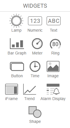
- Lamp
- Numeric
- Text
- Bar Graph
- Meter
- Ring
- Button
- Time
- Image
- iFrame
- Trend
- Alarm Display
- Shape
All widgets share three common setting menus:
Info, Position, and Dimensions.
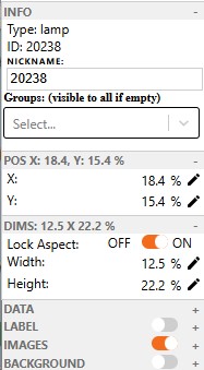
Info
- Type: Displays the widget type.
- ID: Unique identifier automatically assigned to the widget.
- Nickname: Optional custom label for easier identification in the editor.
- Groups: Assigns visibility to specific user groups; visible to all if left empty. Widgets can be assigned to more than 1 group.
Position
- X: Sets the horizontal position of the widget on the canvas.
- Y: Sets the vertical position of the widget on the canvas.
Dimensions
- Lock Aspect: Keeps the width and height ratio fixed when resizing.
- Width: Sets the widget’s width as a percentage of the canvas.
- Height: Sets the widget’s height as a percentage of the canvas.
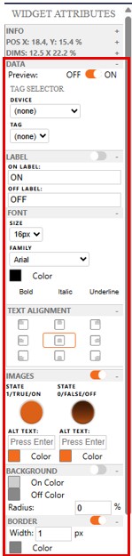
Lamps: ON/OFF status indicators for system states or alarms.
Data
- Preview: Toggles live preview of the widget’s data on the canvas.
- Device: Selects the source device from which the tag data will be read.
- Tag: Specifies the data tag linked to the widget.
Label
- Label Toggle: Enables or disables text labels on the widget.
- On Label: Text displayed when the lamp is in the ON state.
- Off Label: Text displayed when the lamp is in the OFF state.
- Font: Expands options to customize label font size, style, and color.
- Text Alignment: Expands options to align the label text.
Images
- Image Toggle: Enables or disables custom images for the widget states.
- State 1/TRUE/ON: Image displayed when the tag value is ON (true or 1).
- State 0/FALSE/OFF: Image displayed when the tag value is OFF (false or 0).
- Alt Text: Text description shown if the image fails to load
Background
- Background Toggle: Enables or disables custom background colors.
- On Color: Background color when the lamp is ON.
- Off Color: Background color when the lamp is OFF.
- Radius: Rounds the corners of the background shape.
- Border Toggle: Enables or disables border customization options.
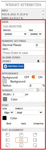
Numeric: Real-time values or static labels displaying numerical data from tags or MQTT topics.
Data
- Device: Selects the data source device that the numeric widget will read from.
- Tag: Specifies the data tag to be displayed by the widget.
Numeric Settings
- Decimal Places: Sets how many digits appear after the decimal point.
- Unit: Adds a unit label next to the numeric value.
- Alarm Zones: Expand to set a high and low range and a color. If it is inside this range then it will change to your set color, outside of this range it will go back to the default values. Limit 5.
Appearance
- Background Toggle: Enables or disables a background color for the widget.
- Background: Sets the background color when enabled.
- Radius: Rounds the corners of the background.
- Border: Expand to enable and customize the widget’s border style, width, and color.
Font
- Size: Sets the font size of the displayed number.
- Family: Selects the font style.
- Color: Changes the text color.
- Bold / Italic / Underline: Toggles bold, italic, or underlined formatting.
Text Alignment
- Alignment Grid: Sets the horizontal and vertical alignment of the text within the widget.
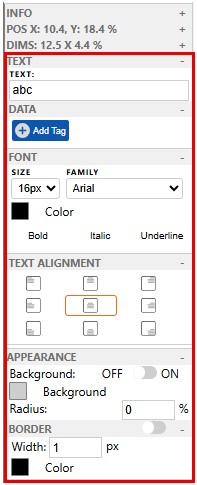
Text: Shows static or dynamic text for labels, titles, and more
Text
- Text: Sets the content displayed by the widget.
- Data: Allows binding the text to a dynamic tag or data source.
- Font: Opens settings for text size, style, and color.
- Text Alignment: Opens options to align text within the widget.
Appearance
- Background Toggle: Enables or disables a background color behind the text.
- Background: Sets the background color when enabled.
- Radius: Adjusts corner roundness of the background.
- Border: Expand to customize border visibility, width, and color.
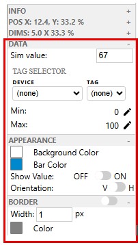
Bar Graph: Horizontal or vertical bars to represent a value’s magnitude.
Data
- Sim value: Sets a manual simulation value for testing without live data.
- Device: Selects the device from which data will be pulled.
- Tag: Specifies the tag linked to the bar graph.
- Min: Defines the minimum value for the bar scale.
- Max: Defines the maximum value for the bar scale.
Appearance
- Background Color: Sets the background color behind the bar.
- Bar Color: Sets the fill color of the bar itself.
- Show Value: Toggles the numeric value display on or off.
- Orientation: Sets the bar direction.
Border
- Border Toggle: Enables or disables the border.
- Width: Sets the thickness of the border in pixels.
- Color: Defines the color of the border.
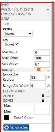
Meters: Analog-style needle gauge to display variable processes like RPM or temperature.
Data
- Device: Selects the source device providing the data.
- Tag: Binds the meter to a specific tag or variable.
- Min Value: Defines the starting point of the meter scale.
- Max Value: Defines the maximum end point of the meter scale.
- Sim Value: Sets a manual value for preview or testing purposes.
Ranges
- Range Arc Radius: Sets the distance of the arc from the axis.
- Range Arc Width: Sets the width of the arc.
Alarm Zones:
- Min/Max: Sets the min/max for a specific zone
- Zone Color: Sets the color for a specific zone
- Limit 5 alarm zones.
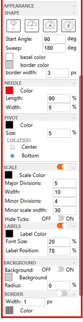
Appearance
- Shape: Defines the arc style of the meter, including angle, sweep, bezel and border color, border width.
- Needle: Controls the needle to visually indicate the current value. Set length and width of needle.
- Pivot: Sets the pivot point’s color, size, and location where the needle rotates from.
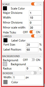
Scale
- Scale Color: Sets the color of the scale markings.
- Major Divisions: Number of main tick marks along the arc.
- Width: Thickness of the major tick marks.
- Minor Divisions: Number of sub-ticks between each major tick.
- Minor Scale Width: Thickness of the minor tick marks.
- Hide Ticks: Toggles visibility of all tick marks on the meter.
Labels
- Label Color: Sets the color of the label.
- Font Size: Sets the font size on the label.
- Label Position: Sets the label distance from the axis.
Background
- Background Toggle: Enables or disables the background color behind the meter.
- Background: Sets the background color when enabled.
- Radius: Adjusts the corner roundness of the background.
Border
- Border Width: Sets the width of the border.
- Color: Sets the color of the border.
Ring: Circular gauge representing percentages or values.
Data
- Device: Selects the data source device for the ring.
- Tag: Binds the widget to a specific data tag.
- Min Value: Sets the minimum value of the ring’s scale.
- Max Value: Sets the maximum value of the ring’s scale.
- Sim Value: Inputs a test value for simulating live data behavior.
Alarm Indication
Alarm Zones
Appearance
- Shape: Expand to customize the visual style of the ring. Set Radial position, Start angle, ring color and width, track color and width.
- Value: Shows or hides the numeric value inside the ring. Set label size for value.
Scale
- Scale Color: Sets the color of the ring’s scale markings.
- Major Divisions: Number of primary tick marks around the ring.
- Width: Thickness of major tick marks.
- Minor Divisions: Number of ticks between major divisions.
- Minor Scale Width: Thickness of minor tick marks.
- Hide Ticks: Toggles visibility of all tick marks on the ring.
Background
- Background Toggle: Enables or disables a background color behind the ring.
- Background: Sets the background color when enabled.
- Radius: Adjusts the roundness of the background corners.
- Border: Expand to enable and customize the border’s color, thickness, and style.
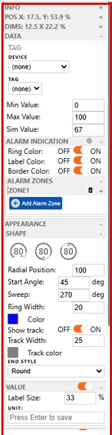
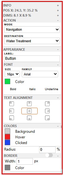
Button: Clickable element that sends commands or toggles values
Action
- Mode: Selects the type of action triggered when the button is pressed.
- Navigation allows you to set your Destination to another project within your domain, allowing separate projects to act like different pages in a project.
- Set Value
- Increment Value
- Decrement Value
Appearance
- Label: Sets the text that appears on the button.
- Font: Adjusts the text’s font size, style, and color.
- Text Alignment: Aligns the label within the button.
- Colors: Sets button background and text colors for different states.
- Radius: Controls the roundness of the button’s corners.
- Border: Expand to enable and customize the border’s thickness and color.
Time: Shows current system time or a formatted time string.
Time & Date Settings
- Timezone: Selects the timezone to display.
- Format: Sets the format of the date and time string.
- Show Date: Toggles display of the date portion.
- Show Time: Toggles display of the time portion.
- Use 24-Hour Time: Toggles between 12-hour and 24-hour time formats.
Font
Text Alignment
Appearance
- Background Toggle: Enables or disables a background color behind the time display.
- Background: Sets the background color when enabled.
- Radius: Adjusts corner roundness.
- Border: Expand to add and customize the border style, color, and thickness.
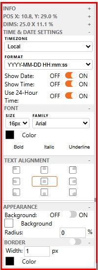
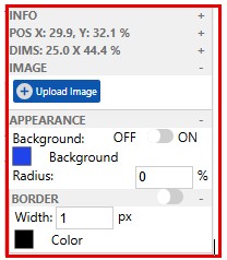
Image: Inserts a static or dynamic image.
Image Settings
- Upload Image: Allows you to upload and display a custom image file in the widget. Size limit 5mb, all formats are acceptable.
Appearance
- Background Toggle: Enables or disables a background color behind the image.
- Background: Sets the background color when enabled.
- Radius: Rounds the corners of the image container.
- Border: Expand to customize border visibility, color, and width.
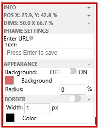
iFrame: Embeds external web (URL) content into the dashboard.
iFrame Settings
- Enter URL: Sets the web address to embed content (e.g., dashboards, videos, or tools).
- Text: Optional label or caption displayed with the embedded content.
Appearance
- Background Toggle: Enables or disables a background behind the embedded content.
- Background: Sets the background color when enabled.
- Radius: Adjusts the corner roundness of the widget frame.
- Border: Expand to enable and customize border color, width, and style.
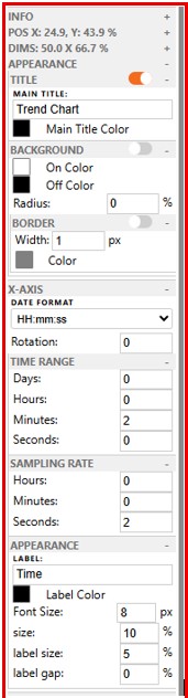
Trend: Displays real-time or historical trend graphs.
Appearance
- Title: Enables or disables a title above the trend graph (expand to edit text and style).
- Background: Enables or disables a background color behind the chart (expand to customize).
X-Axis
- Date Format: Sets how time is displayed on the X-axis.
- Rotation: Rotates X-axis labels by the specified degree.
- Time Range / Sampling Rate / Appearance: Expand to adjust period, data polling frequency, and visual style.
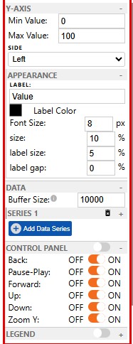
Y-Axis
- Min Value: Sets the minimum numeric value on the Y-axis.
- Max Value: Sets the maximum numeric value on the Y-axis.
- Side: Positions the Y-axis on the left or right side of the chart.
- Appearance: Expand to customize the look of the Y-axis.
Data
- Buffer Size: Sets the maximum number of data points stored for the trend graph.
- Series 1: Represents an individual data series; each series can be customized or removed.
- Add Data Series: Adds a new line or data set to the trend chart for tracking additional variables.
Control Panel
- Control Panel Toggle: Enables or disables the on-screen navigation controls.
- Back: Allows users to scroll backward in the data timeline.
- Pause-Play: Toggles between pausing and resuming live data updates.
- Forward: Allows users to scroll forward in the data timeline.
- Up / Down: Scrolls the Y-axis up or down.
- Zoom Y: Enables zooming in/out on the Y-axis for a detailed view.
Legend
- Shows or hides the legend that labels each data series in the chart.
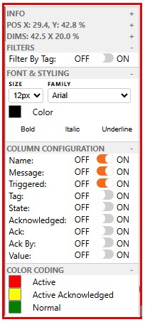
Alarm Display: Shows active and historical alarms with timestamps and severity.
Filters
- Filter By Tag: When enabled, only alarms linked to the selected tag(s) will be shown in the display
Font & Styling
- Size: Sets the font size for the alarm text.
- Family: Selects the font type.
- Color: Sets the text color.
- Bold / Italic / Underline: Toggles additional font styling options.
Column Configuration
- Name: Displays the name of the alarm.
- Message: Shows the alarm message or description.
- Triggered: Indicates when the alarm was activated.
- Tag: Displays the tag associated with the alarm.
- State: Shows the current state of the alarm.
- Acknowledged: Indicates whether the alarm has been acknowledged.
- Ack: Shows the acknowledge button if enabled.
- Ack By: Displays the user who acknowledged the alarm.
- Value: Shows the value that triggered the alarm.
Color Coding
- Active: Alarm is currently triggered and unacknowledged.
- Active Acknowledged: Alarm is still active but has been acknowledged.
- Normal: Alarm condition has cleared; system is in normal state.
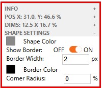
Shape: Adds basic graphical elements like lines, circles, and rectangles. Currently only supports squares as a background element.
Shape Settings
- Shape Color: Sets the fill color of the shape.
- Show Border: Toggles the visibility of the shape’s border.
- Border Width: Defines the thickness of the border.
- Border Color: Sets the color of the border.
- Corner Radius: Rounds the shape’s corners.